Idiot Light
But that last one was an indicator, not an "idiot light." The term itself comes from frustration with the motor industry for replacing indicators that could tell the driver what was happening as it happened (for example, my car is gradually over-heating) with "fault signals" that just turned on when the car reached the fault state. Indicator? Awesome, I'm in control and I can see what's happening, and potentially FIX it before a fault occurs. Error light on the dashboard? Great, now I have to pull over because the fault state has already happened. Idiot!
In the case of the Earth, I believe there are indicators and fault lights we can observe to tell us what's going on with our environment. Watching the video above makes me think of a giant, red, flashing light on Dashboard Earth. Glaciers are retreating and/or disappearing around the globe. Warning! Danger! Yikes! Pull over!
Pull over, Earth.
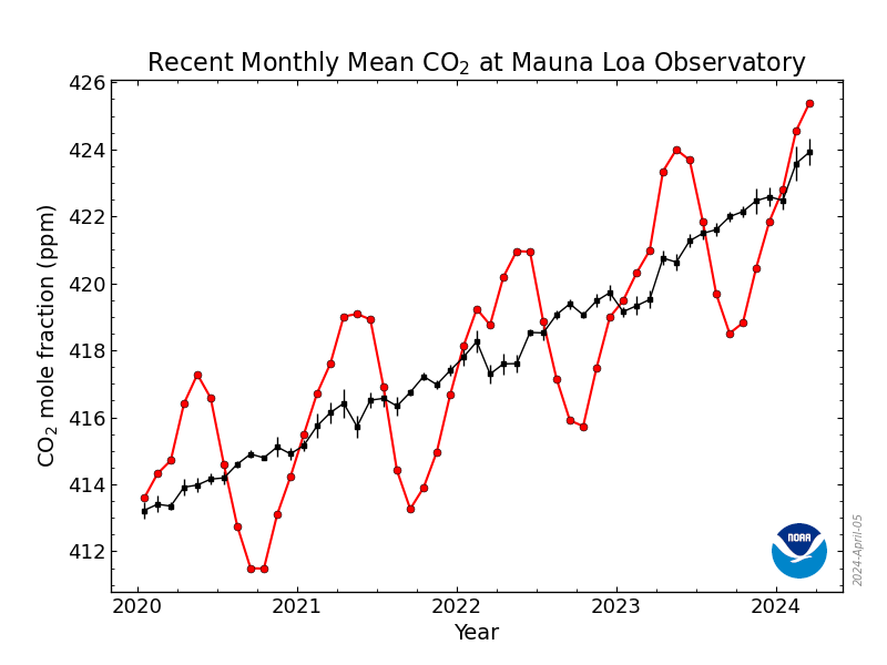
Sometimes, depending on the car, you got an idiot light AND an indicator. One car we remember had an indicator for fuel, AND it would turn on an idiot light when the gauge got down to 1/8 of a tank. In that case, the term "idiot" could take on a slightly different meaning, as in, "Hey idiot, get some gas!" So if we can see one "fault" occurring with melting glaciers, what was our indicator? What gauge could we have turned to for a warning that something was going wrong?
How about this:
We think the scariest part of that chart is how high the last peak of C02 parts per million is above the previous peak - how high will the next one be? We have to use this data to take action to mitigate global warming though active, scientific efforts. Right?
Forward!


Comments
Post a Comment